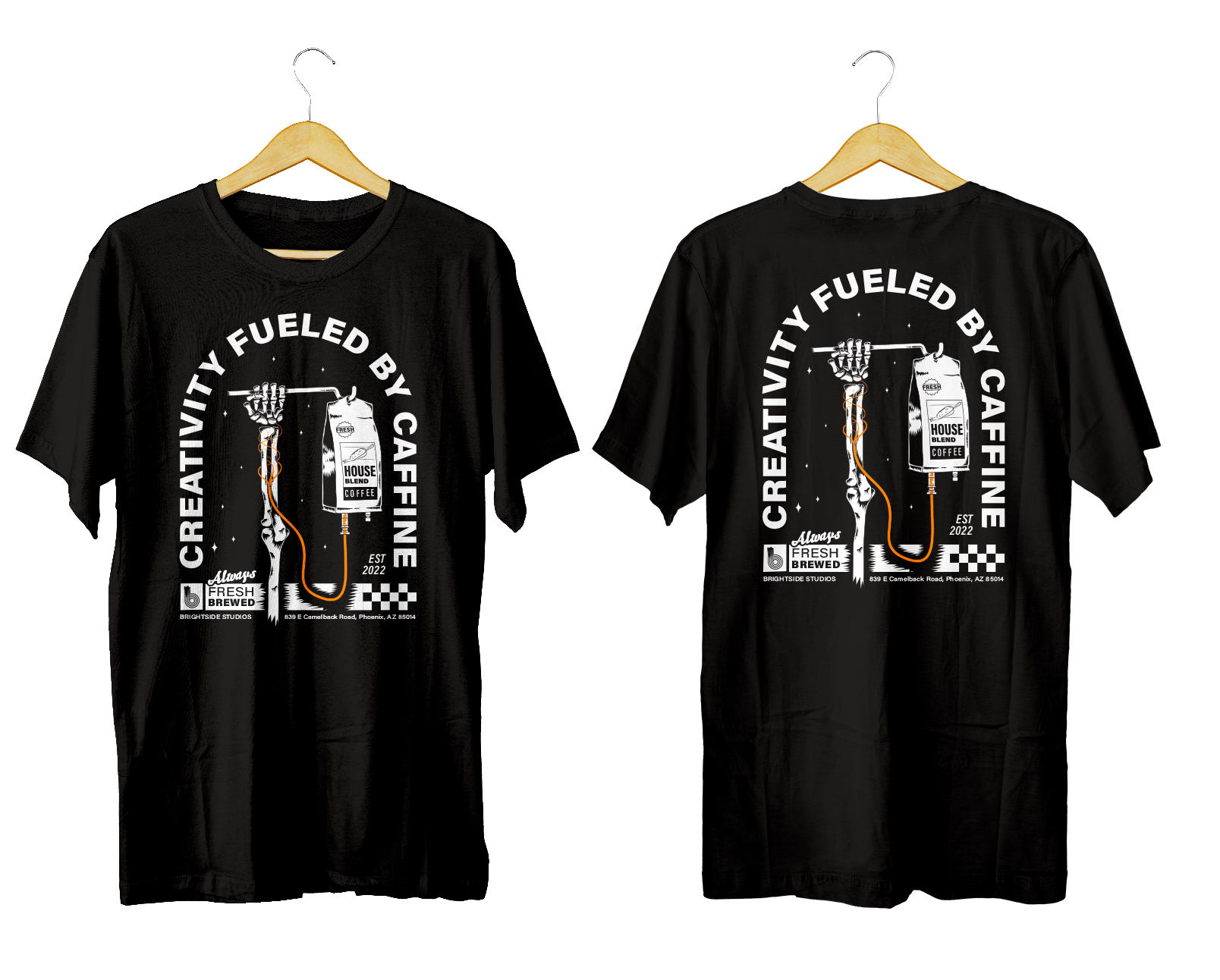
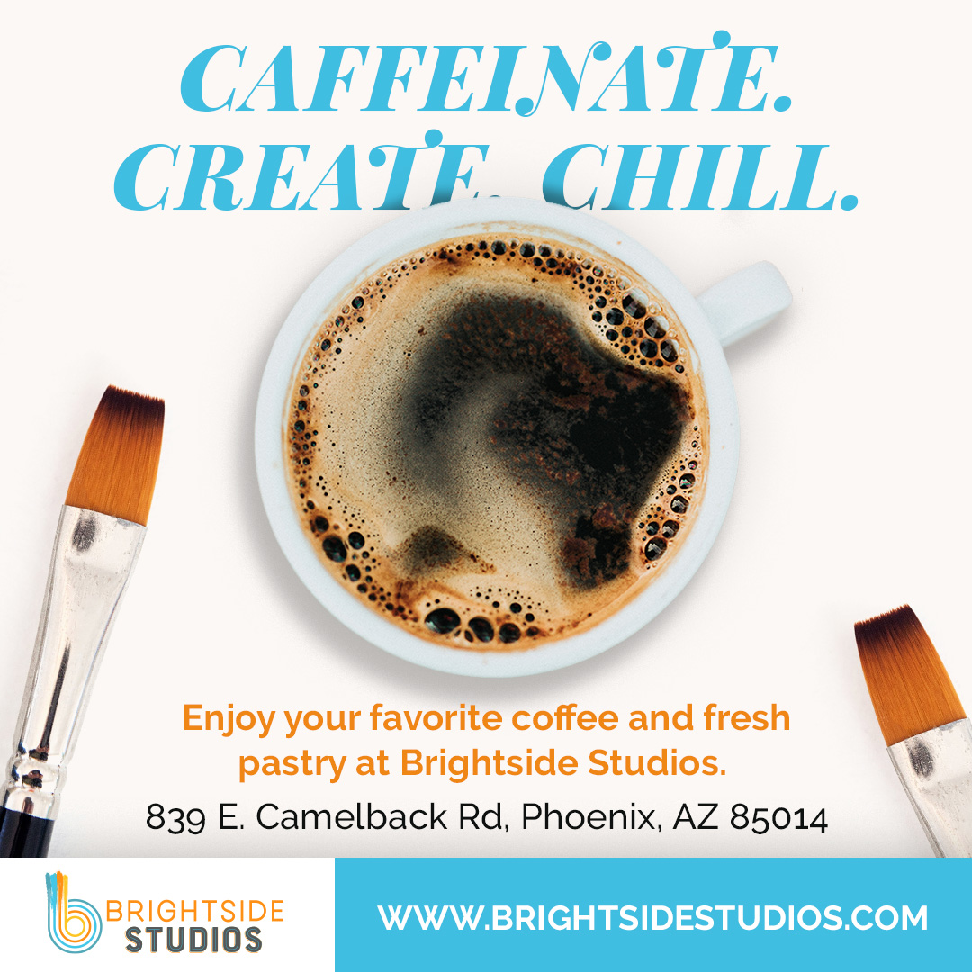
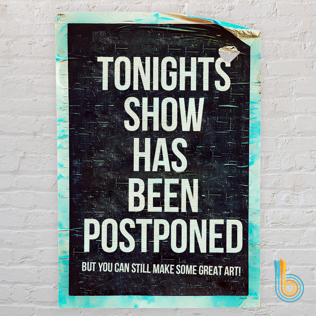
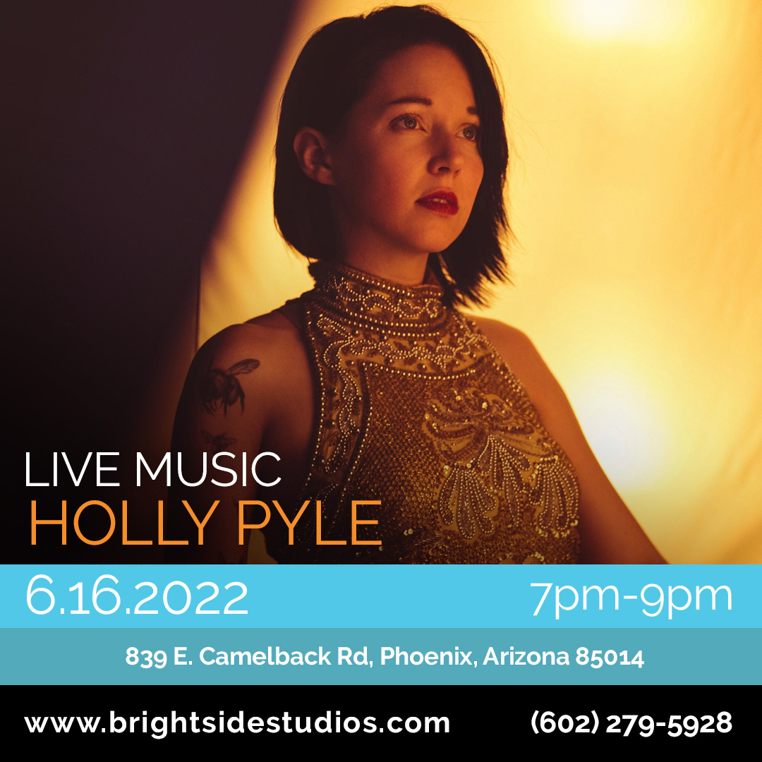
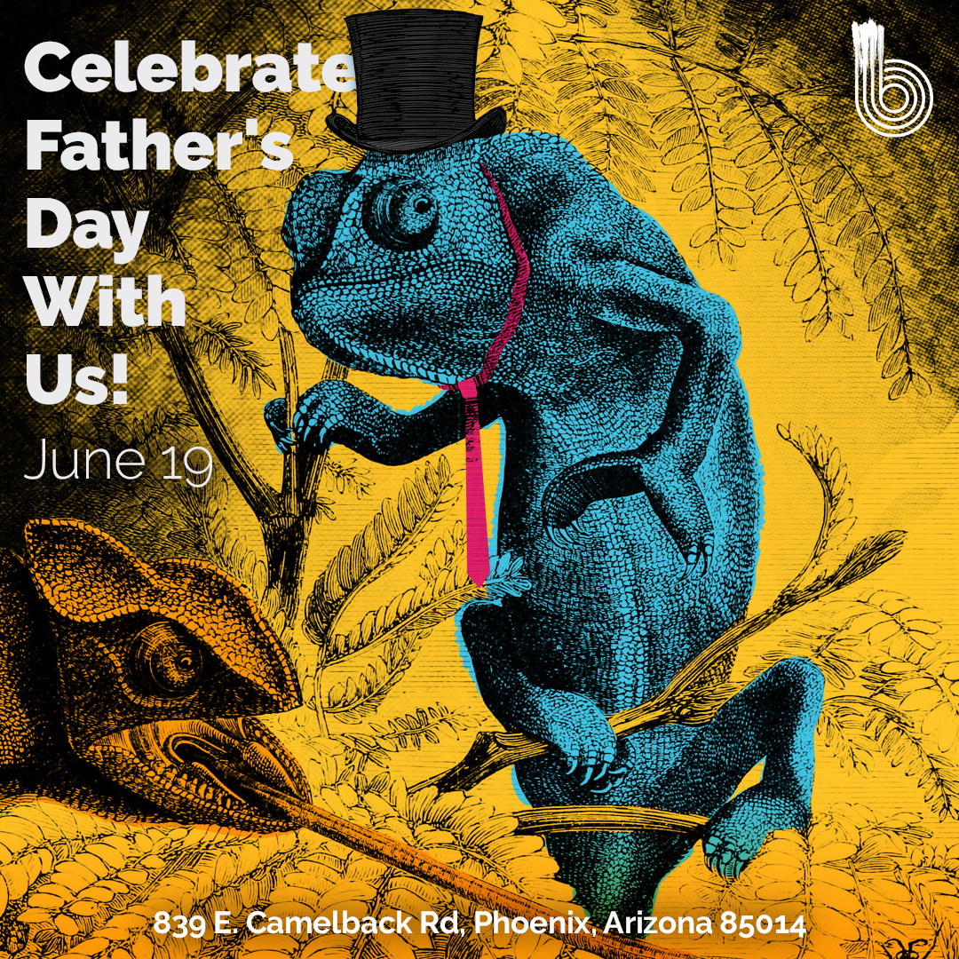
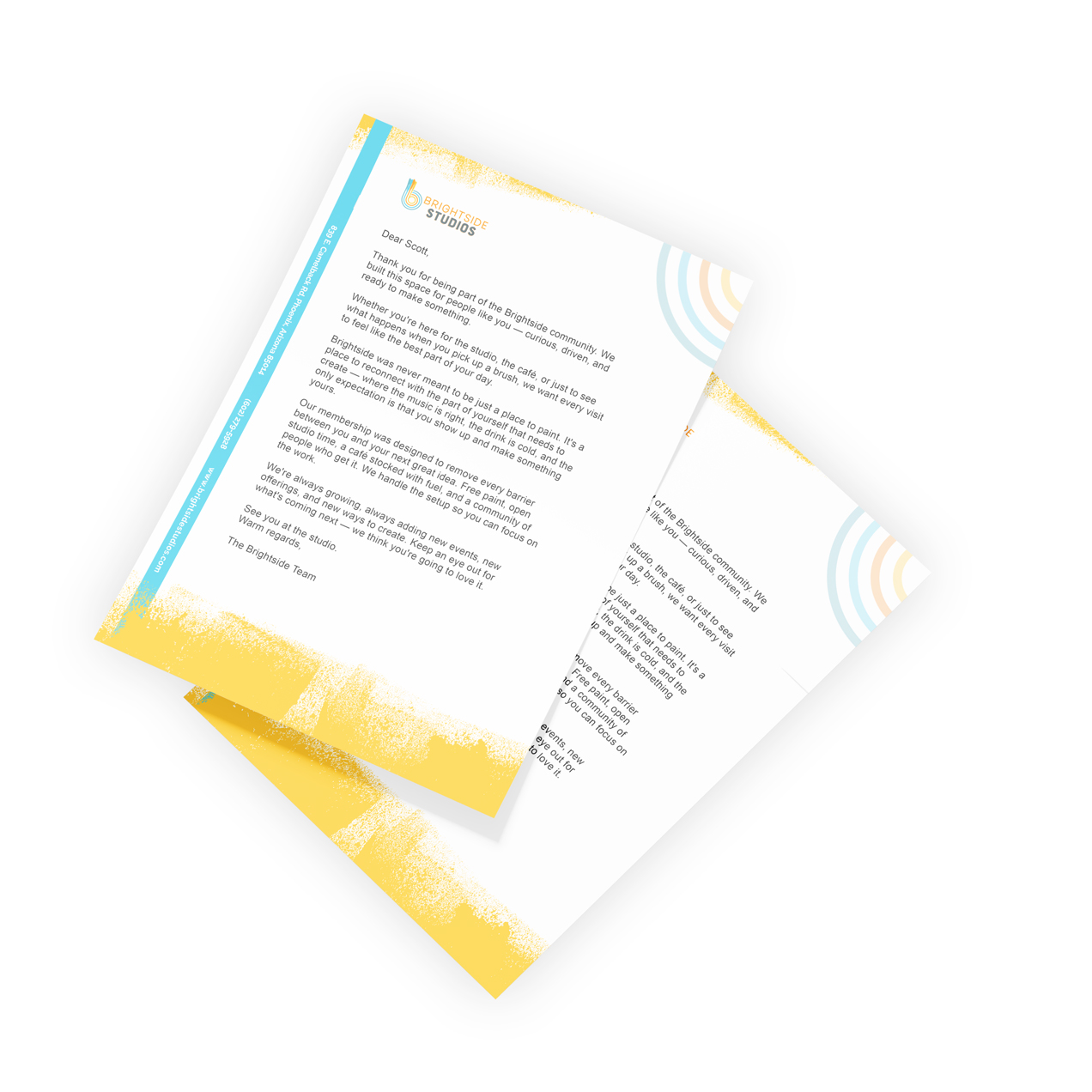
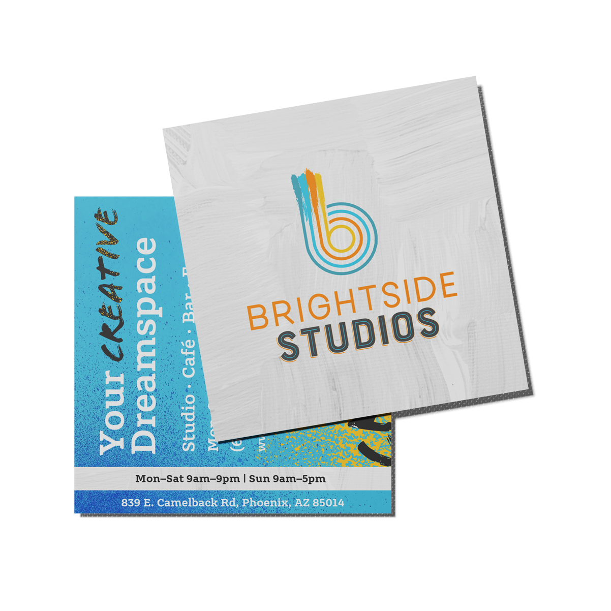
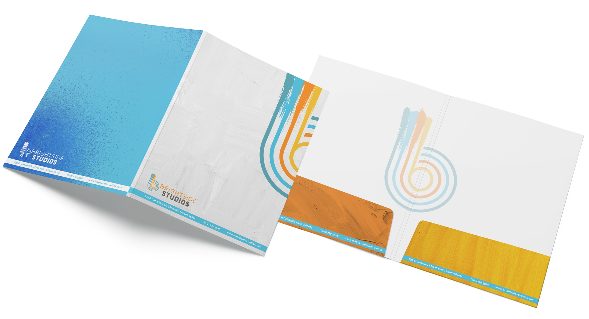
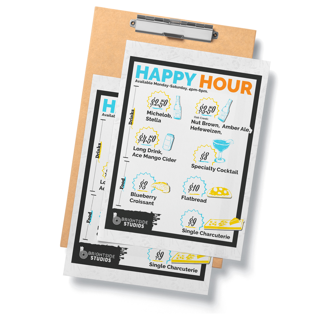
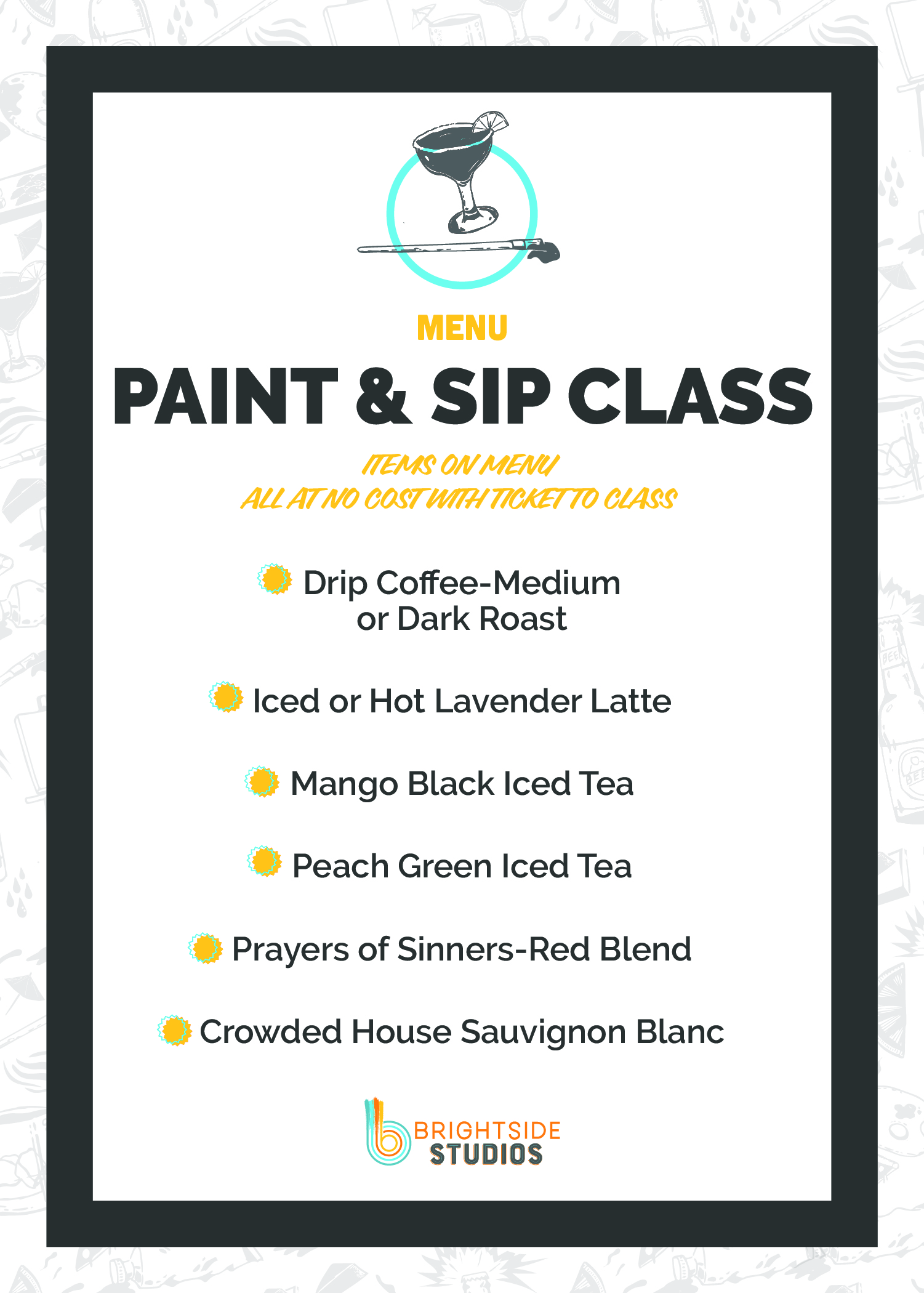
Case Study 

Creating an Integrated Brand Experience

Omnichannel Visual Storytelling

The Request

Brightside Studios had a compelling concept — a membership-based creative space where artists could paint freely, grab a drink, catch live music, and just make things. But their story was mostly living inside their building. They needed a brand presence that could travel and tell a story: printed materials, social content, signage, and merch that carried the same energy their members felt the moment they walked in.

Role

Brand Designer / Art Director — concepting and executing an integrated visual system across print, digital, and physical environments.
Brightside wasn't just a studio to me. It was the ultimate feeling of imagination and creativity come to life. My job was to bottle that and put it everywhere.
-Daniel

Strategy

The goal was to turn Brightside's in-person energy into a recognizable visual language that worked across every touchpoint — from a sandwich board on the sidewalk to a scroll-stopping Instagram post.
  • Develop a flexible art direction rooted in texture, loose brushwork, and expressive color
  • Create materials that felt handcrafted and alive, not corporate or templated
  • Build a consistent brand voice that balanced creativity with community
  • Treat every touchpoint as a chance to deepen the story, not just push a promotion

The Solution

Rather than a single campaign, this was an ecosystem build with every piece designed to feel cohesive while giving each medium room to breathe and do its own thing.

One Sheets

Promotional flyers for the Creative Café that balanced appetite appeal with brand warmth — giving both walk-ins and potential members a tangible taste of what Brightside had to offer. Legibility was more of a focus here.

How It Helped Expand: Promotional flyers for the Creative Café that balanced appetite appeal with brand warmth — giving both walk-ins and potential members a tangible taste of what Brightside had to offer. Legibility was more of a focus here.  

Outdoor/Indoor Signage

Bold, direct, and a little irreverent. The aerosol warning sign is a perfect example — a rule communicated with enough personality that it still felt on-brand.

How It Helped Expand: Turned everyday rules into brand moments, proving that even functional communication could carry personality.

Organic + Paid Social

From membership deals to event promotion, the social graphics leaned into high contrast and punchy copy to stop the scroll while staying true to the studio's creative DNA.

How It Helped Expand: Extended the studio's walls into the feed, reaching future members before they ever knew Brightside existed.

T-shirts

Two distinct directions: one leaning into caffeine-and-creativity culture, the other channeling disciplined artistry through a Japanese-inspired aesthetic. Both designed to live outside the studio and spark conversation.

How It Helped Expand: Transformed members into walking billboards with designs people actually wanted — merch as mythology-building.

Printed Materials

Designed a full suite of branded print collateral — letterhead, business cards, and folders — that gave Brightside a polished, cohesive presence in every physical touchpoint.

How It Helped Expand: Every piece was built from the same visual language, reinforcing the brand system across physical touchpoints and ensuring the story didn't stop when someone walked out the door.

Menus

Designed to feel as considered as the food and drinks themselves — extending the brand experience to every table in the café.

How It Helped Expand: Made the café feel intentional, not incidental — reinforcing that every corner of Brightside was part of one cohesive creative world.

Stickers

Surrealist, playful, and shareable — the oil paint illustration captures Brightside's philosophy perfectly: creativity isn't just something you do, it's something that lives in your head.

How It Helped Expand: Small format, big statement — a low-barrier entry point for the brand to live in the wild and spark curiosity by being whimsical, odd and unique.

What Did I Learn

  • A brand story doesn't live in one place. The real work is translating it across mediums without losing the soul of what makes it feel alive.
  • A cohesive brand system doesn't require rigidity. Anchoring Brightside's identity in texture, loose brushwork, and expressive color created room to flex across formats while still feeling like one brand.
  • Loose and intentional aren't opposites. Defining an art direction around painterly marks and organic imperfection created more creative freedom, not less, because the style itself became the system.

Interested in working together?