ATRA
Who: Paid media focused marketing company
Role: Creative Manager | Designer
Responsibility: Collaborated with the CEO and VP of Operations to determine a name, logo for a new company, as well as an experimental design used throughout a unique brand system
Strategy
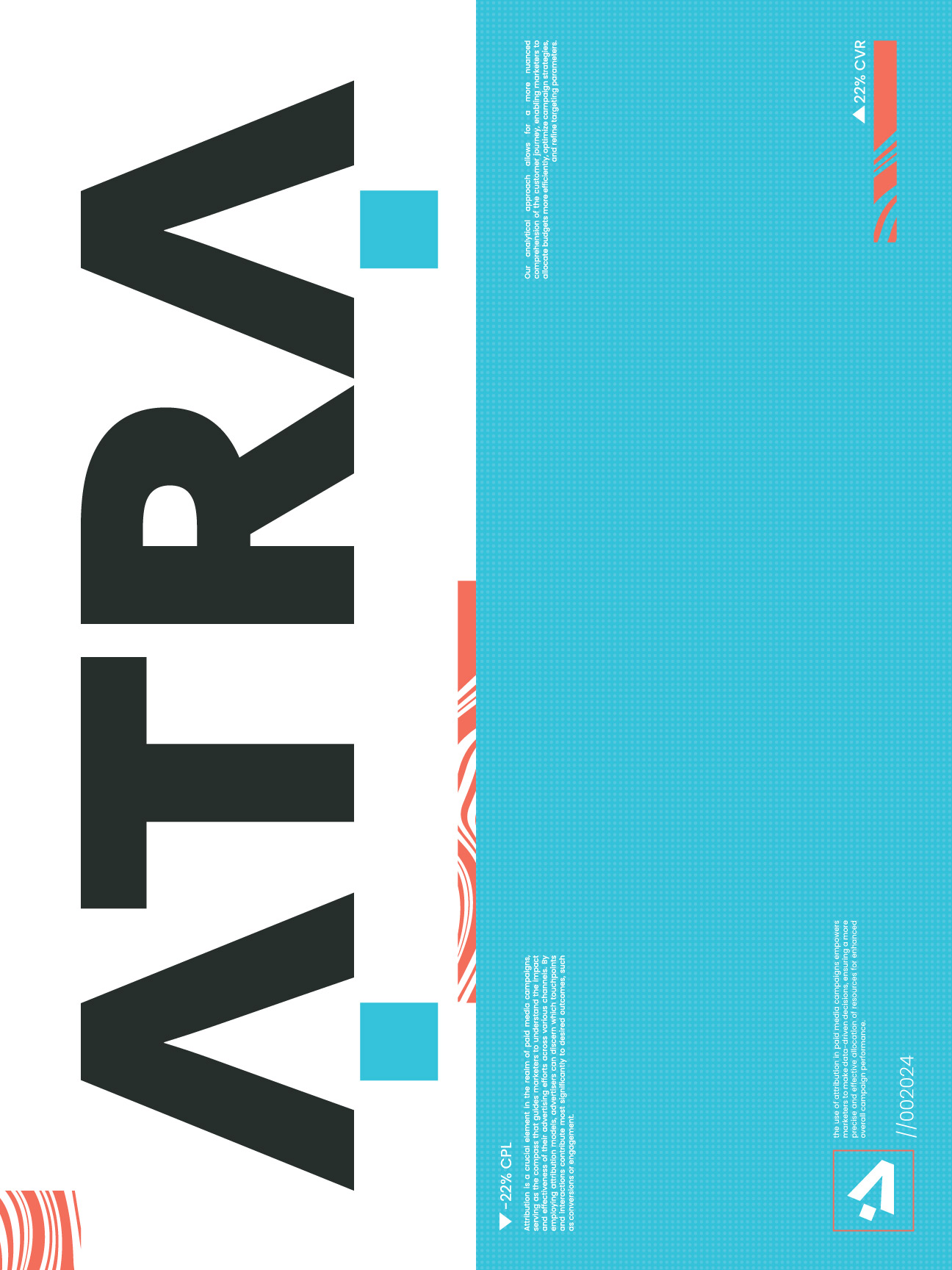
The visual strategy was built around maximum contrast as a philosophical stance. The color system, near-black grounds with a sharp electric cyan, was chosen specifically to feel alien in the marketing agency space where warm neutrals and corporate blues dominate. Typographically the wordmark is set with tight mechanical spacing that signals precision and focus. The extended layout system embraced asymmetry and texture to give every application a restless forward-moving energy that matched the agency's data-driven but creatively experimental positioning.
Logo
The logo itself was meant to be simple and straight-forward. After some exploration, a decision was made on this logo which featured 2 abstract mouse cursors at the front and back of the logo, making the A, also symbolizing from first to last click of a user.
Exploration
- After researching colors with other marketing agencies, the brand colors were chosen as to stand out and disrupt the competition
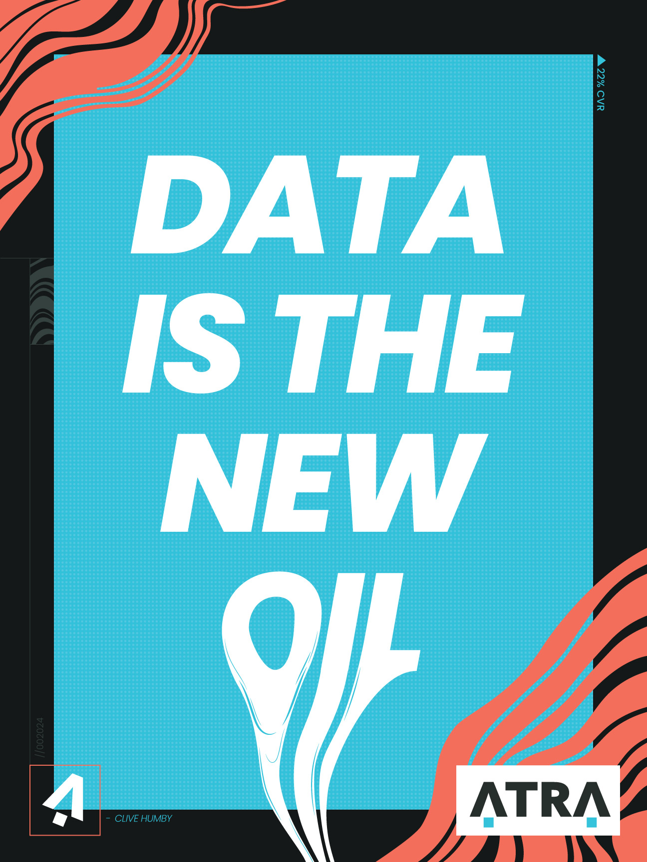
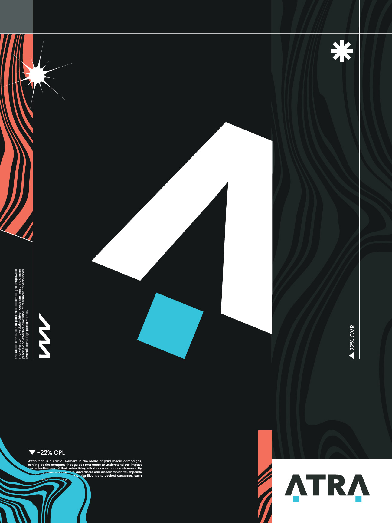
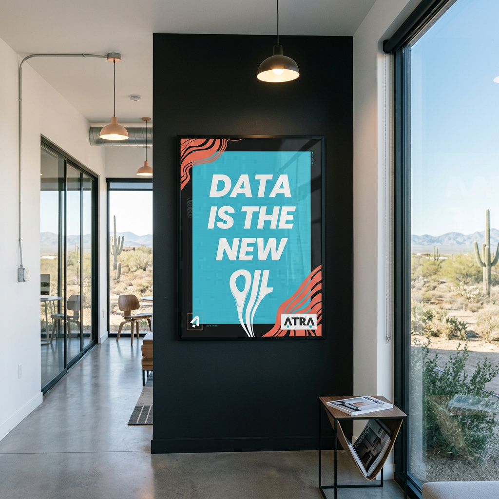
- The designs for the company itself ranged from creating posters for inside the office to skateboards
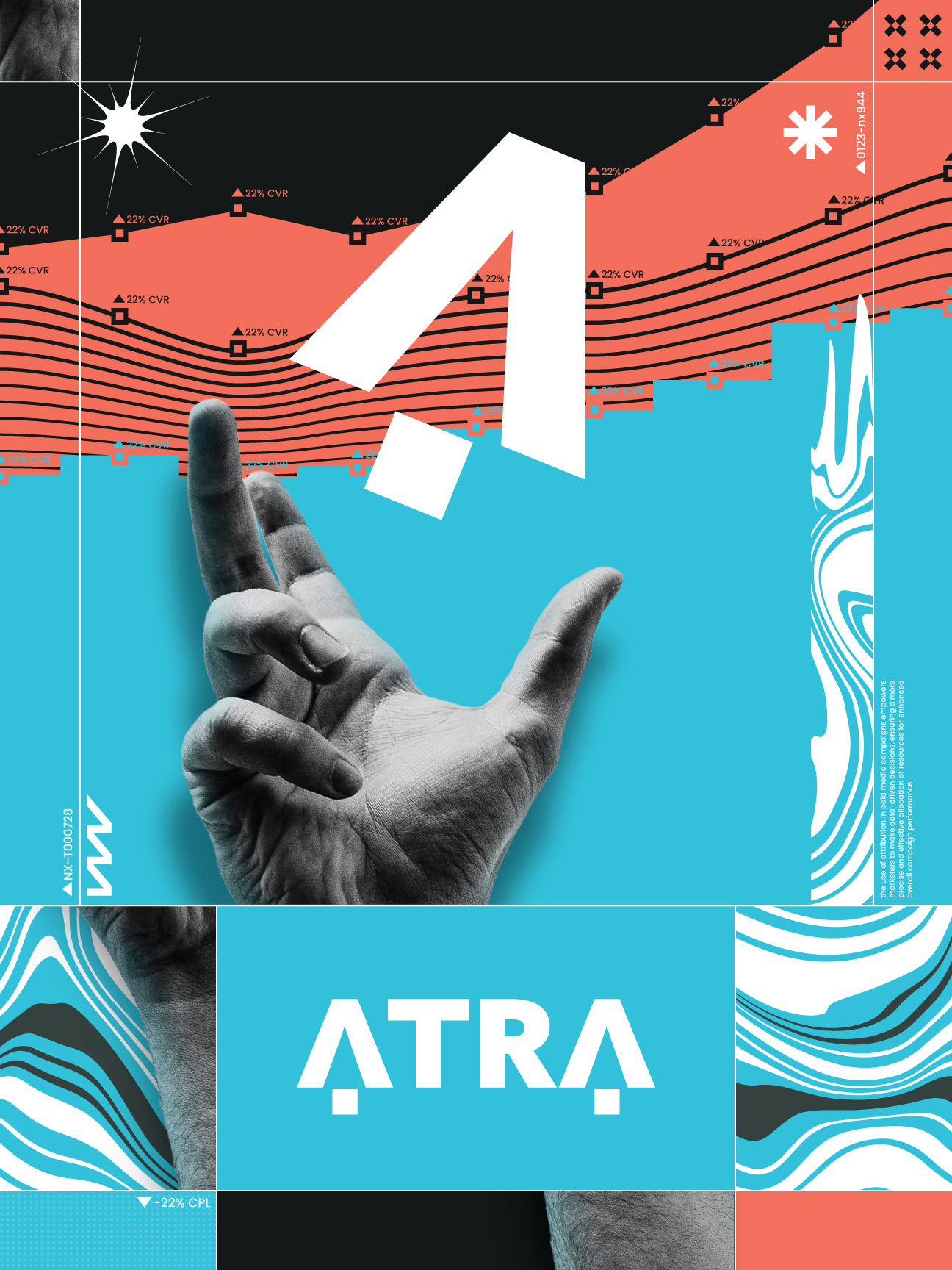
- The designs were meant to be a mixture of mystical, digital, data-influenced and heavily abstract
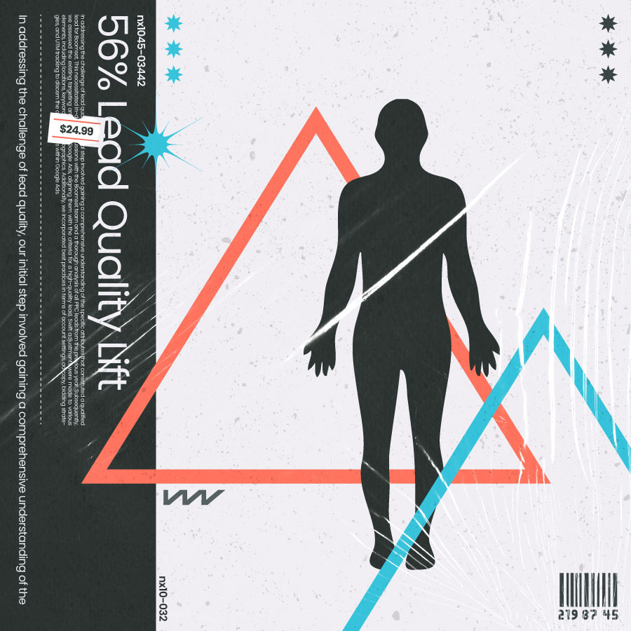
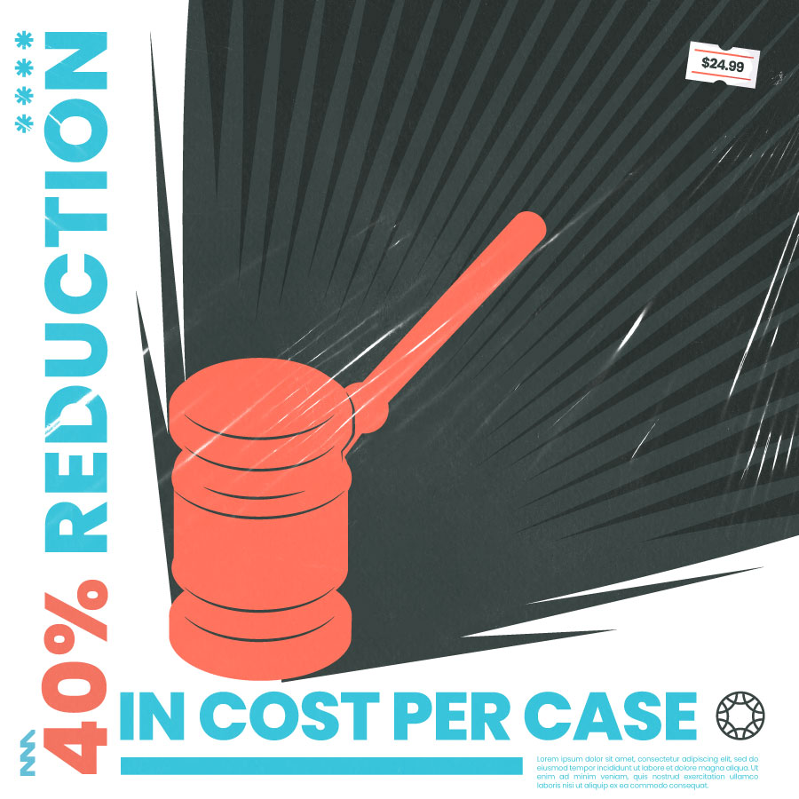
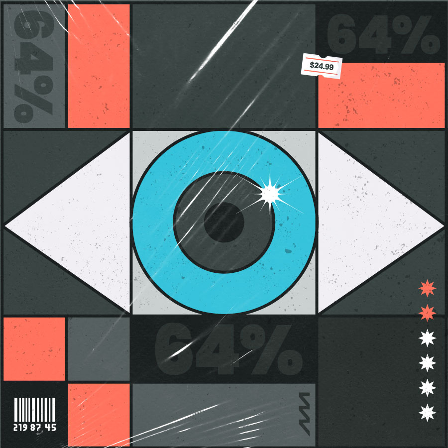
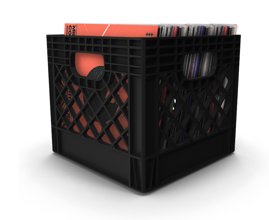
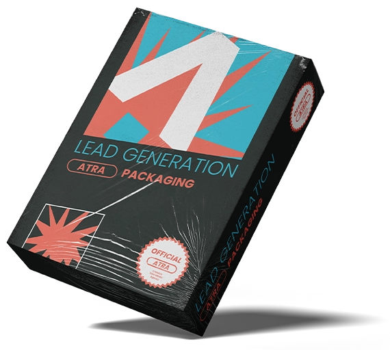
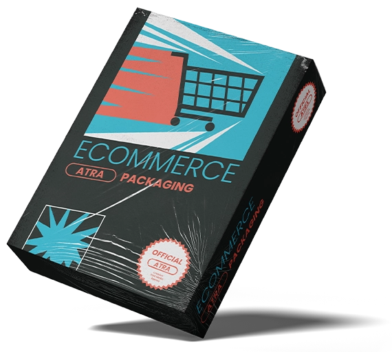
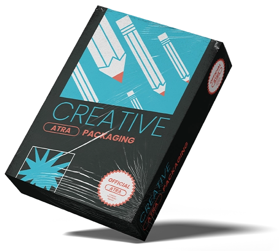
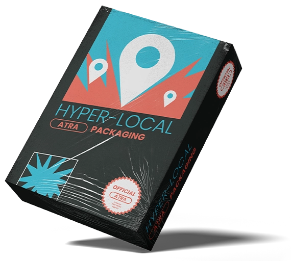
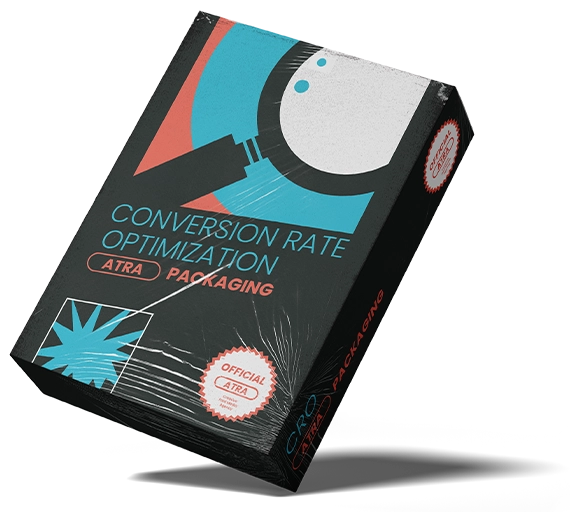
- The entire team loves music so we decided that our case studies could be represented with somewhat the same abstract style as the posters, but related to the case study material at hand, and look like an album cover
Case Study Covers



Office Posters
Brand Intro Video
Strategy
The visual strategy was built around maximum contrast as a philosophical stance. The color system, near-black grounds with a sharp electric cyan, was chosen specifically to feel alien in the marketing agency space where warm neutrals and corporate blues dominate. Typographically the wordmark is set with tight mechanical spacing that signals precision and focus. The extended layout system embraced asymmetry and texture to give every application a restless forward-moving energy that matched the agency's data-driven but creatively experimental positioning.
Logo
The logo itself was meant to be simple and straight-forward. After some exploration, a decision was made on this logo which featured 2 abstract mouse cursors at the front and back of the logo, making the A, also symbolizing from first to last click of a user.
Exploration
- After researching colors with other marketing agencies, the brand colors were chosen as to stand out and disrupt the competition
- The designs for the company itself ranged from creating posters for inside the office to skateboards
- The designs were meant to be a mixture of mystical, digital, data-influenced and heavily abstract
- The entire team loves music so we decided that our case studies could be represented with somewhat the same abstract style as the posters, but related to the case study material at hand, and look like an album cover
Case Study Covers
Office Posters
Brand Intro Video
Logo
Primary Logo
Mark
Primary Mark

Exclusion zone
Color Palette
Primary Colors
Hex: #252D2B
RGB: 37/45/43
CMYK: 18/0/4/82
RGB: 37/45/43
CMYK: 18/0/4/82
Hex: #31C1DA
RGB: 49/193/218
CMYK: 78/11/0/15
RGB: 49/193/218
CMYK: 78/11/0/15
Secondary Colors
Hex: #FF6F59
RGB: 255/111/89
CMYK: 0/56/65/0
RGB: 255/111/89
CMYK: 0/56/65/0
Hex: #151A1A
RGB: 21/26/26
CMYK: 19/0/0/90
RGB: 21/26/26
CMYK: 19/0/0/90
Hex: #515B5B
RGB: 81/91/91
CMYK: 11/0/0/64
RGB: 81/91/91
CMYK: 11/0/0/64
Hex: #F0EEF3
RGB: 240/238/243
CMYK: 1/2/0/5
RGB: 240/238/243
CMYK: 1/2/0/5
Hex: #FFFFFF
RGB: 255/255/255
CMYK: 0/0/0/0
RGB: 255/255/255
CMYK: 0/0/0/0
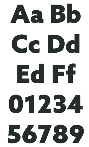
Typography
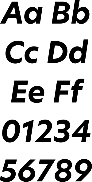
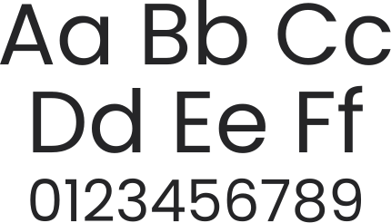
Typeface: New Hero

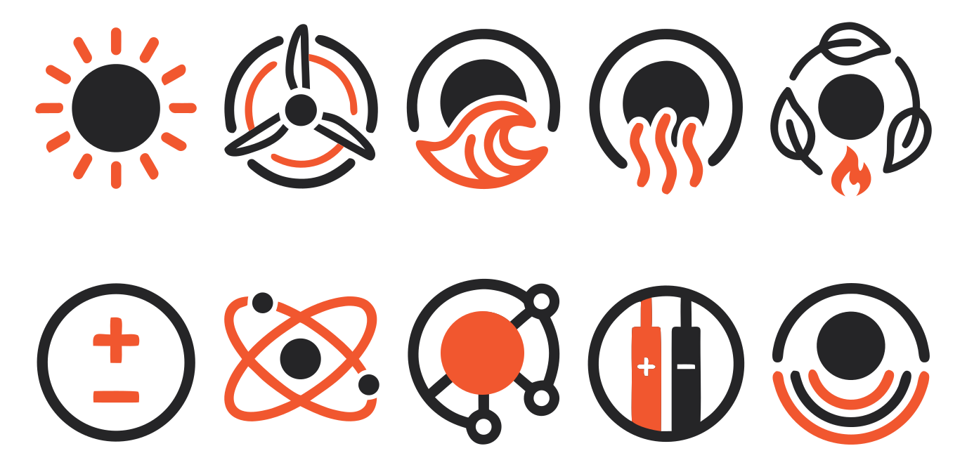
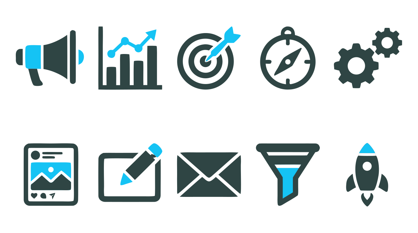
Icongraphy
Primary Icons
Photography
Abstract
Case Study Covers
Office Posters
Website


Brand Intro Video
Services
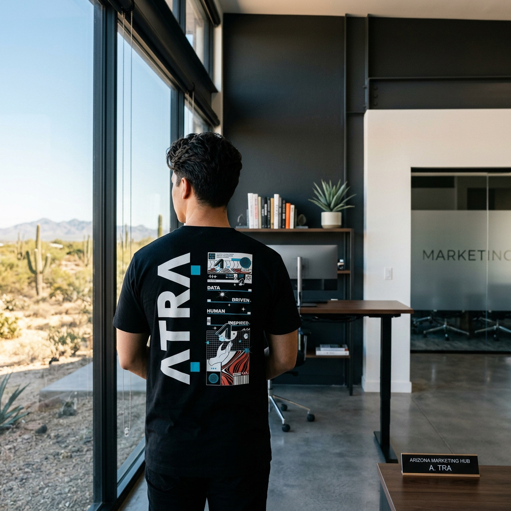
Shirts