Discover the different branding projects I have worked on.
How I approach branding.
Research
Audit the market, know your audience, and map your competitors. Uncover the white space your brand can own.
Foundation
Define your mission, vision, and values. This is the strategic core everything else is built on.
Develop
Translate strategy into identity: name, voice, visual language, and positioning.
Build
Create brand guidelines and roll out consistently across all touchpoints — web, packaging, social, and beyond.
Maintain
Show up consistently, tell your story on the right channels, and build trust over time.
Grow
Track loyalty, gather feedback, evolve thoughtfully, and protect your identity as you scale.
Branding Projects
Proteum Energy
Role: Art Director
Responsibility: Collaborated with the client/team to develop a visual identity centered around a predefined typographic direction
Strategy
The strategy centered on visual restraint as the core differentiator. Where most energy brands default to aggressive color and heavy typography, Proteum went the opposite direction, using generous white space as an active element in the composition. The layout lets the mark breathe and command attention through isolation rather than density. The typographic direction used a geometric sans that carries scientific precision without coldness, with tight tracking on the wordmark reinforcing the technical character throughout the system.
Brand Colors
By looking at competitors to the client, I was able to establish colors that relate to their industry and name, but also help it stand out from what their competitors are using for brand colors
The final product ended with a minimal use of color, letting the space around it help it stand out and create an impact
Exploration
The initial designs start with exploring off shapes that can relate to carbon and hydrogen particles
Explored a wide range of abstract logo ideas to find a direction that felt modern and energetic
Iterated through different geometric shapes and symbol concepts to refine the balance, movement, and overall feel of the final mark
Tested multiple logo layouts, proportions, and typography pairings to create a strong connection between the icon and wordmark
Final
Brand Colors
Primary
#252527
Primary
#f1572f
Primary
#f4efe8
Secondary
#0077b6
Secondary
#ced1d6
Secondary
#f7f7f7
Exploration
Final
Mark
Brand Colors
Primary
#252D2B
Primary
#34403E
Primary
#31C1DA
Secondary
#FF6F59
Secondary
#151A1A
Secondary
#515B5B
Secondary
#F0EEF3
Secondary
#FFFFFF
Office Posters
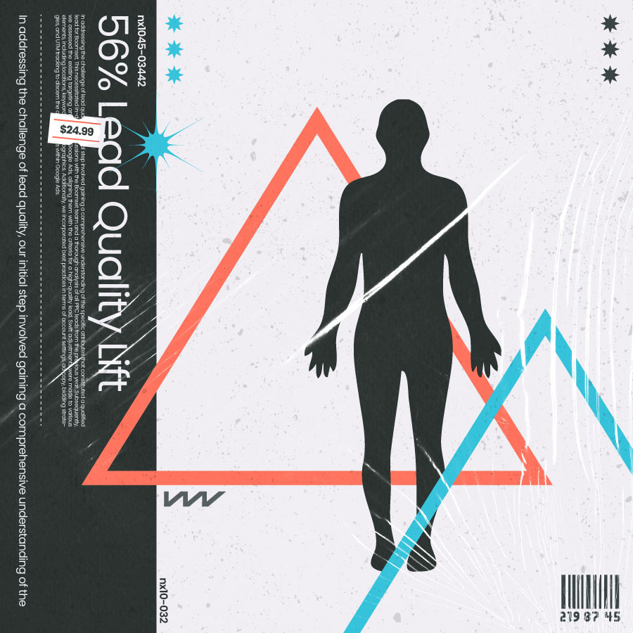
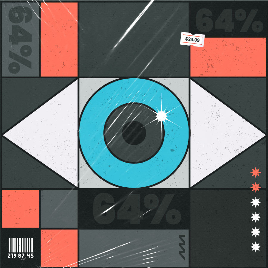
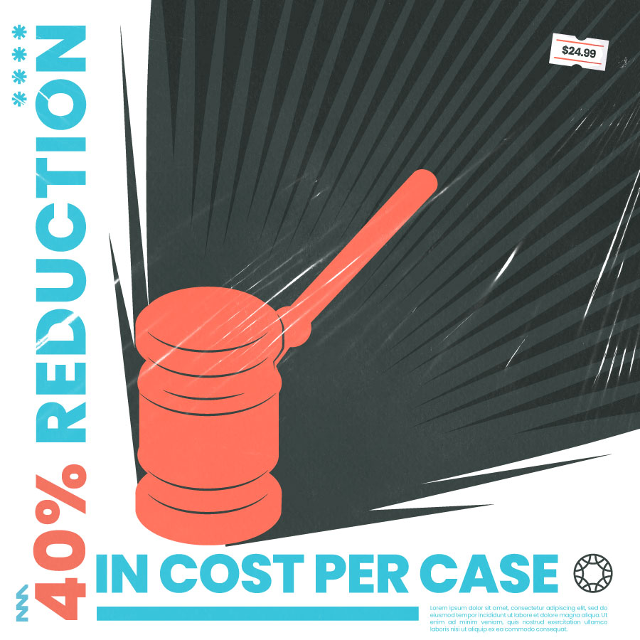
Case Study Covers
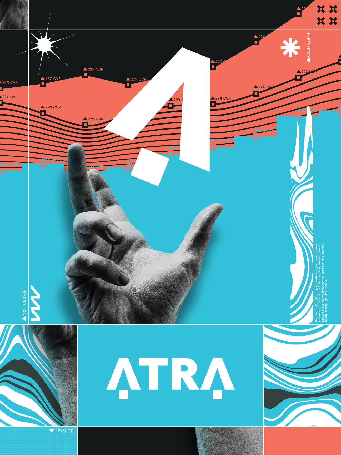
ATRA
Role: Creative Manager | Designer
Responsibility: Collaborated with the CEO and VP of Operations to determine a name and logo for a new company
Strategy
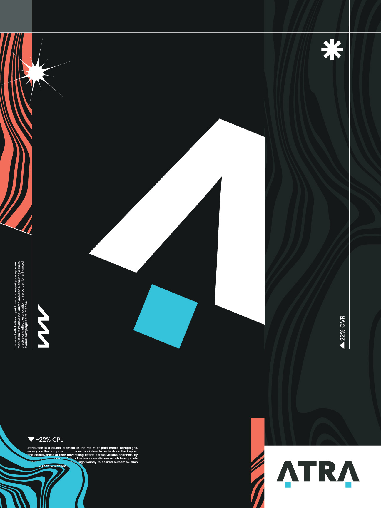
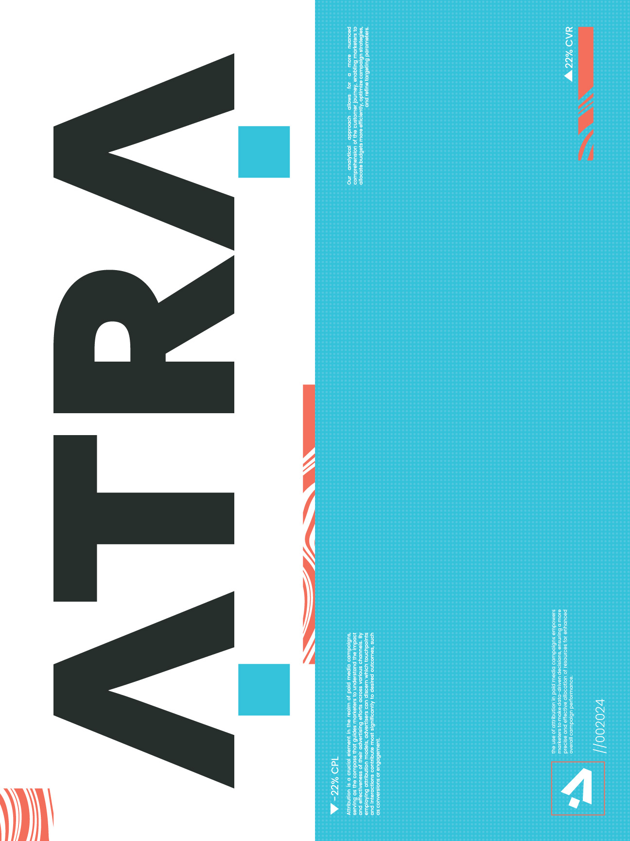
The visual strategy was built around maximum contrast as a philosophical stance. The color system, near-black grounds with a sharp electric cyan, was chosen specifically to feel alien in the marketing agency space where warm neutrals and corporate blues dominate. Typographically the wordmark is set with tight mechanical spacing that signals precision and focus. The extended layout system embraced asymmetry and texture to give every application a restless forward-moving energy that matched the agency's data-driven but creatively experimental positioning.
Logo
The logo itself was meant to be simple and straight-forward. After some exploration, a decision was made on this logo which featured 2 abstract mouse cursors at the front and back of the logo, making the A, also symbolizing from first to last click of a user.
Exploration

After researching colors with other marketing agencies, the brand colors were chosen as to stand out and disrupt the competition
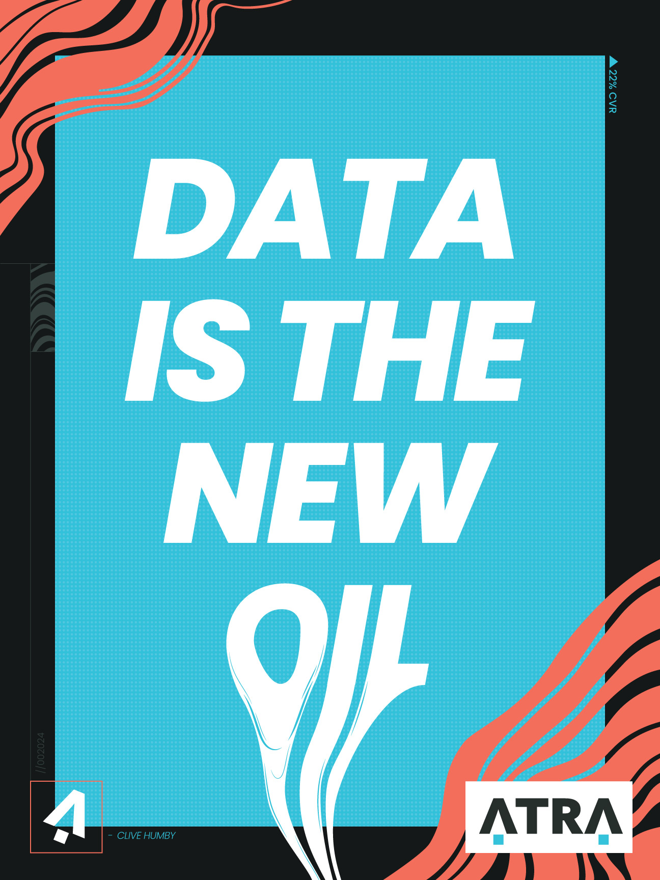
The designs for the company itself ranged from creating posters for inside the office to skateboards
The designs were meant to be a mixture of mystical, digital, data-influenced and heavily abstract
The entire team loves music so we decided that our case studies could be represented with somewhat the same abstract style as the posters, but related to the case study material at hand, and look like an album cover
SunState Medical
Role: Designer
Responsibility: Developed a spec brand identity concept for a medical company based in Arizona
Strategy
The visual strategy worked against the category default. Most medical brands communicate trust through cool blues and rigid grid layouts, which read as institutional rather than human. SunState's color system was built on a warmer architecture, a primary gold that carries optimism and desert warmth, balanced against a muted slate blue that supplies clinical credibility. The typography pairs a humanist sans for approachability with tighter-spaced utility type for labels and data, creating a hierarchy that feels both trustworthy and accessible across every layout.
Brand Colors
Researched common color trends used throughout the medical and healthcare industry to establish familiarity and trust
Used a limited, high-contrast color palette to keep the identity clean, modern, and easy to recognize
Balanced professional medical aesthetics with warmer regional colors to help the brand feel approachable and distinct
Exploration
Explored a wide range of color combinations of competitors in the medical/healthcare industry to see what we can use to stand out
Tested different typography styles ranging from modern sans-serifs to more traditional type treatments to refine the brand personality
Evaluated multiple font pairings to create strong hierarchy, readability, and a clean medical feel
Final
Mark
Brand Colors
Primary
#F1C019
Primary
#465C69
Primary
#ffffff
Secondary
#151A1A
Secondary
#7FD8BE
Secondary
#A1FCDF
Secondary
#E84855
Color Exploration
Typography Exploration
Final
Brand Colors Exploration
Primary
#ffcd69
Primary
#ffffff
Primary
#0d1321
Primary
#00a7e1
Secondary
#114b5f
Secondary
#ff9fb2
Secondary
#ffe1ab
ECO Mammoth
Role: Designer
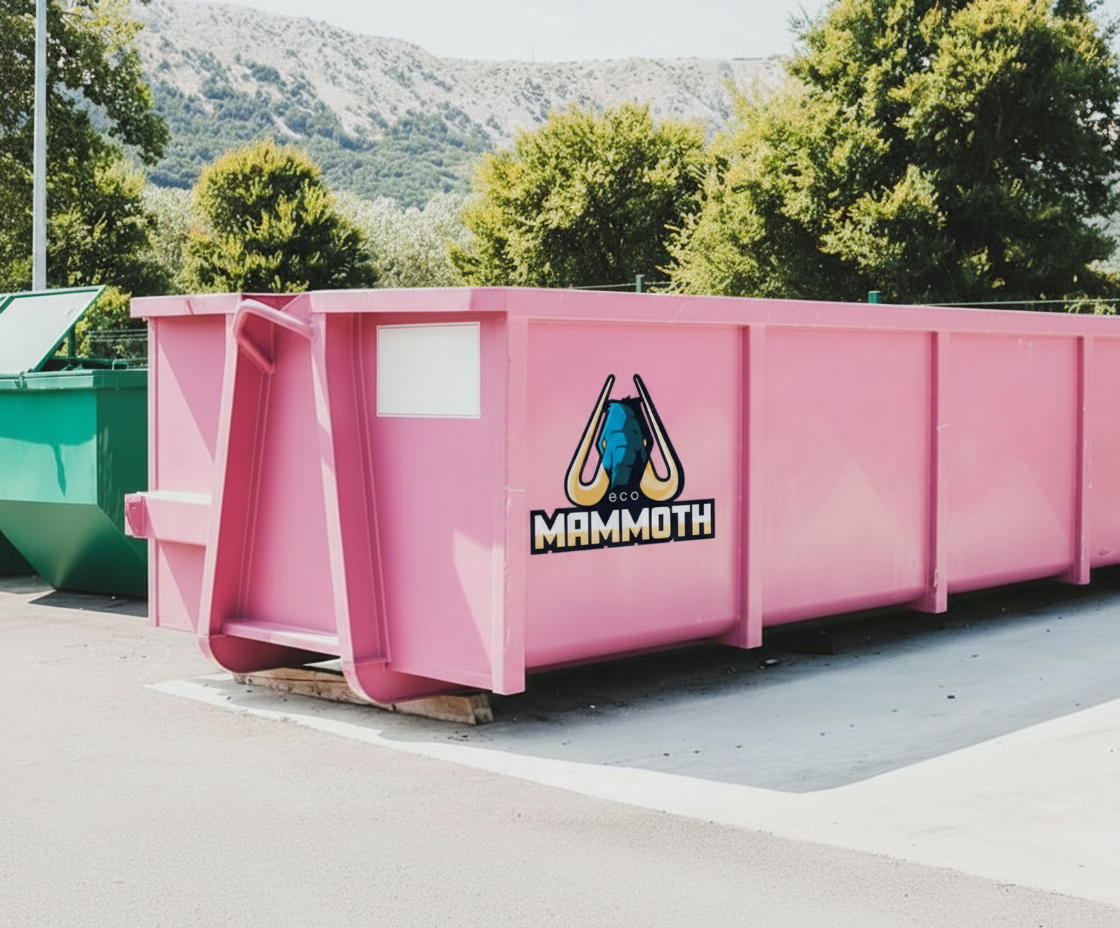
Responsibility: Do a quick exploration into a single design
Strategy
Construction brands almost universally default to heavy black type, orange safety colors, and aggressive energy. ECO Mammoth was designed to flip that entirely. The primary yellow is playful and almost cartoonish at large scale, deliberately so, creating instant visual recognition in a space that takes itself too seriously. The mammoth mark was drawn with weight and confidence but given rounded approachable details. Compositionally the identity system leans into scale contrast, the mark large and commanding, the wordmark compact and secondary, so every layout application has a single memorable visual anchor.
Background
A San Francisco based start-up was looking for us to do a quick-spec proposition work into a construction-based dumpster company idea. Ultimately they did not receive funding to be able to start work.
What Did I Learn
The exploration phase is where the best typography and composition decisions get made. Pressure to land quickly on a direction often skips the iteration that reveals what actually works
Restraint in color is a composition decision, not a limitation. Limiting a palette to two or three tones forces every color moment to carry weight, which creates more impact
Whitespace is an active element in a layout, not empty space waiting to be filled
Competitive audit is a color and composition exercise as much as a strategy one
A brand system needs to hold up at every scale, from a favicon to a billboard