Project Overview
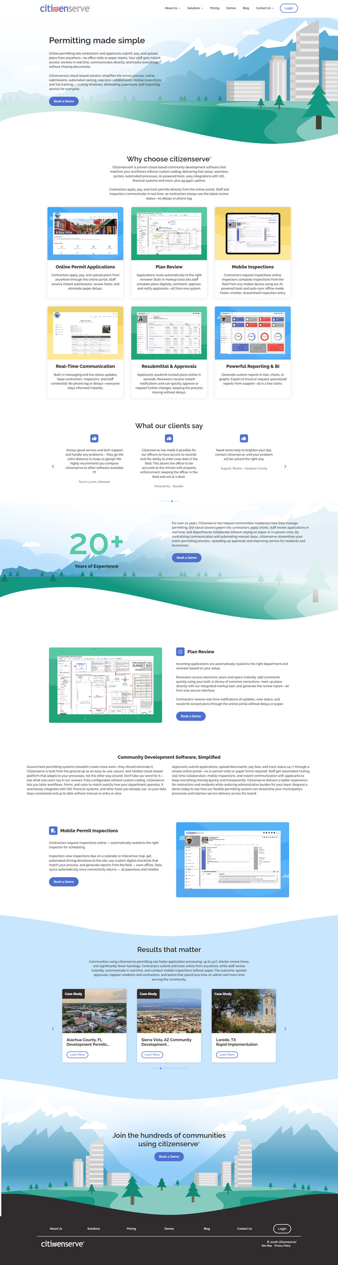
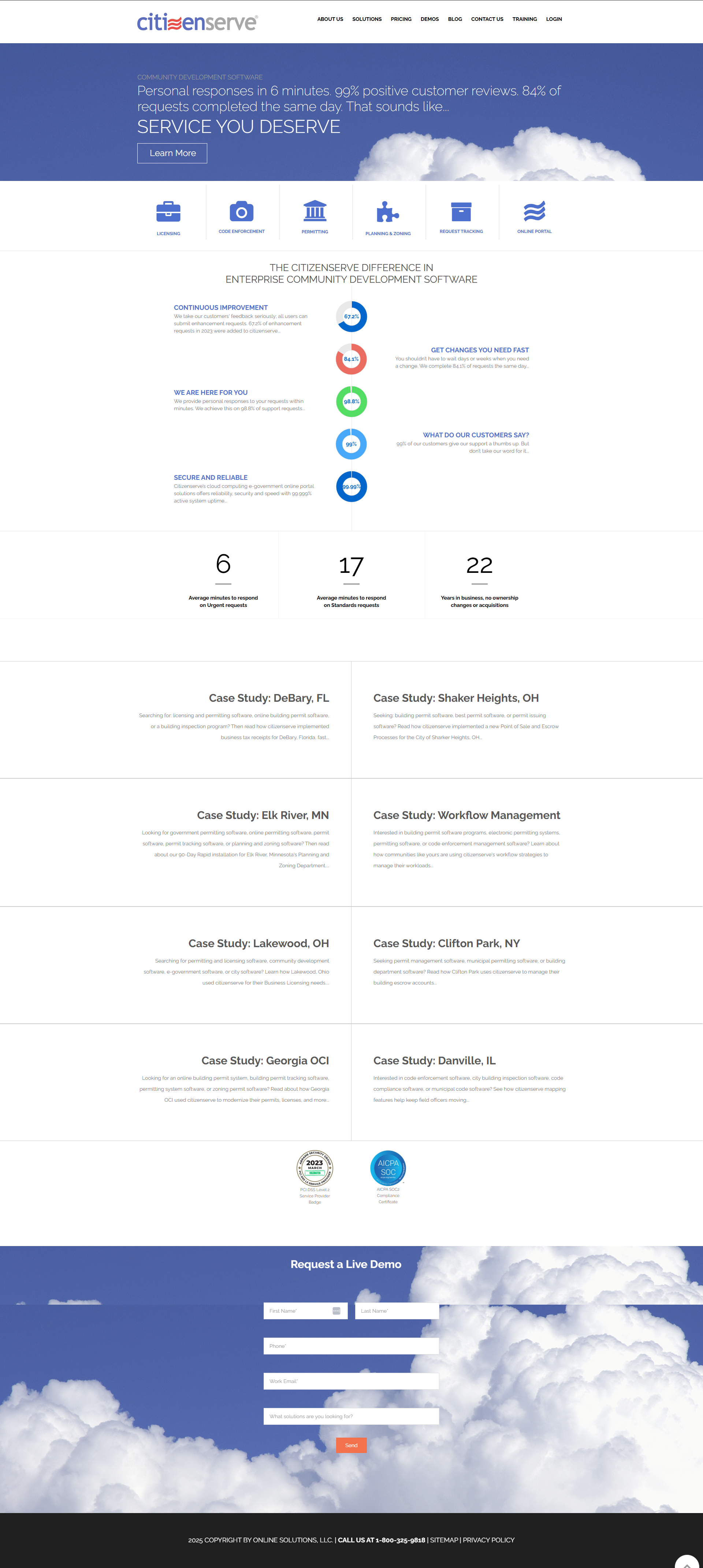
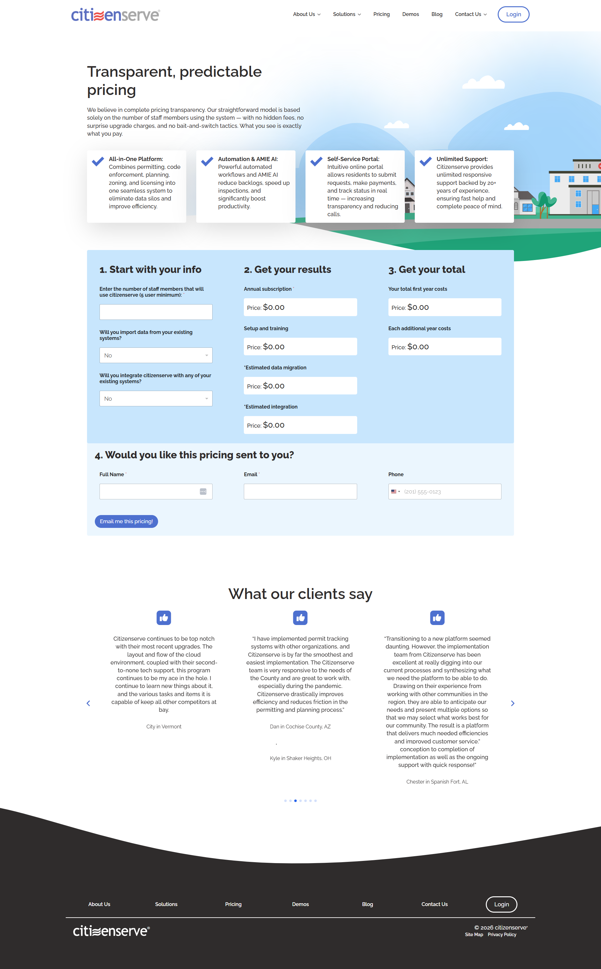
The existing site's visual language worked against it. Dense software screenshots used as hero imagery, inconsistent typographic scale across pages, and a color system with no clear hierarchy created an experience that felt cluttered and dated.
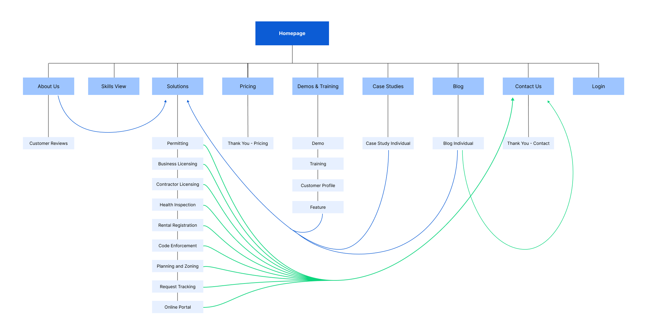
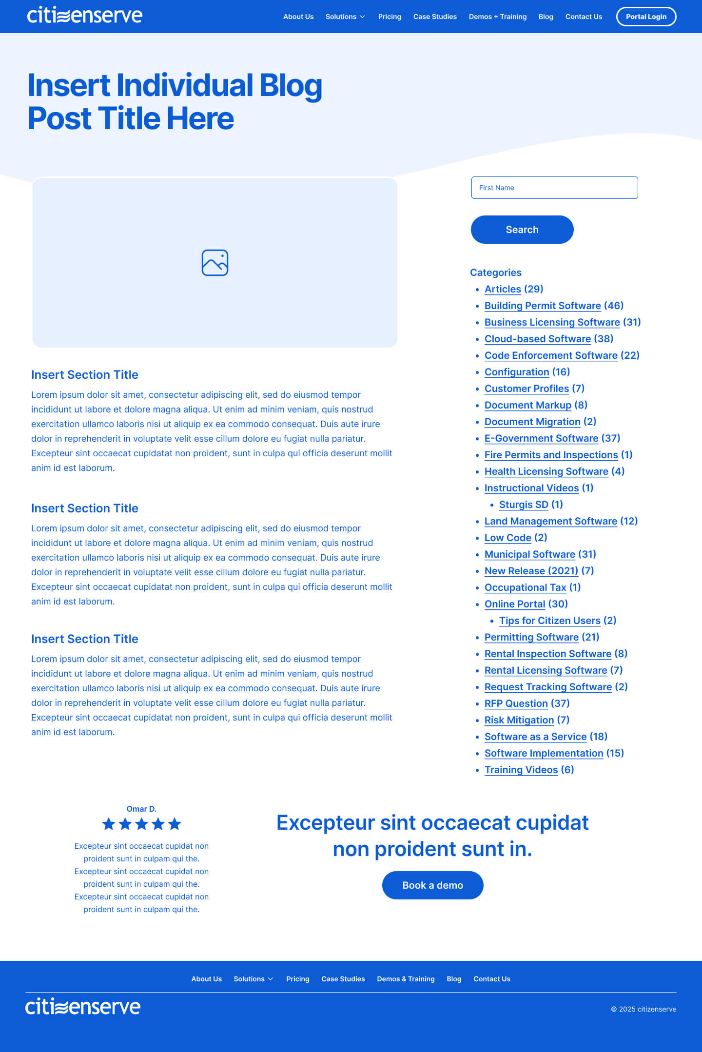
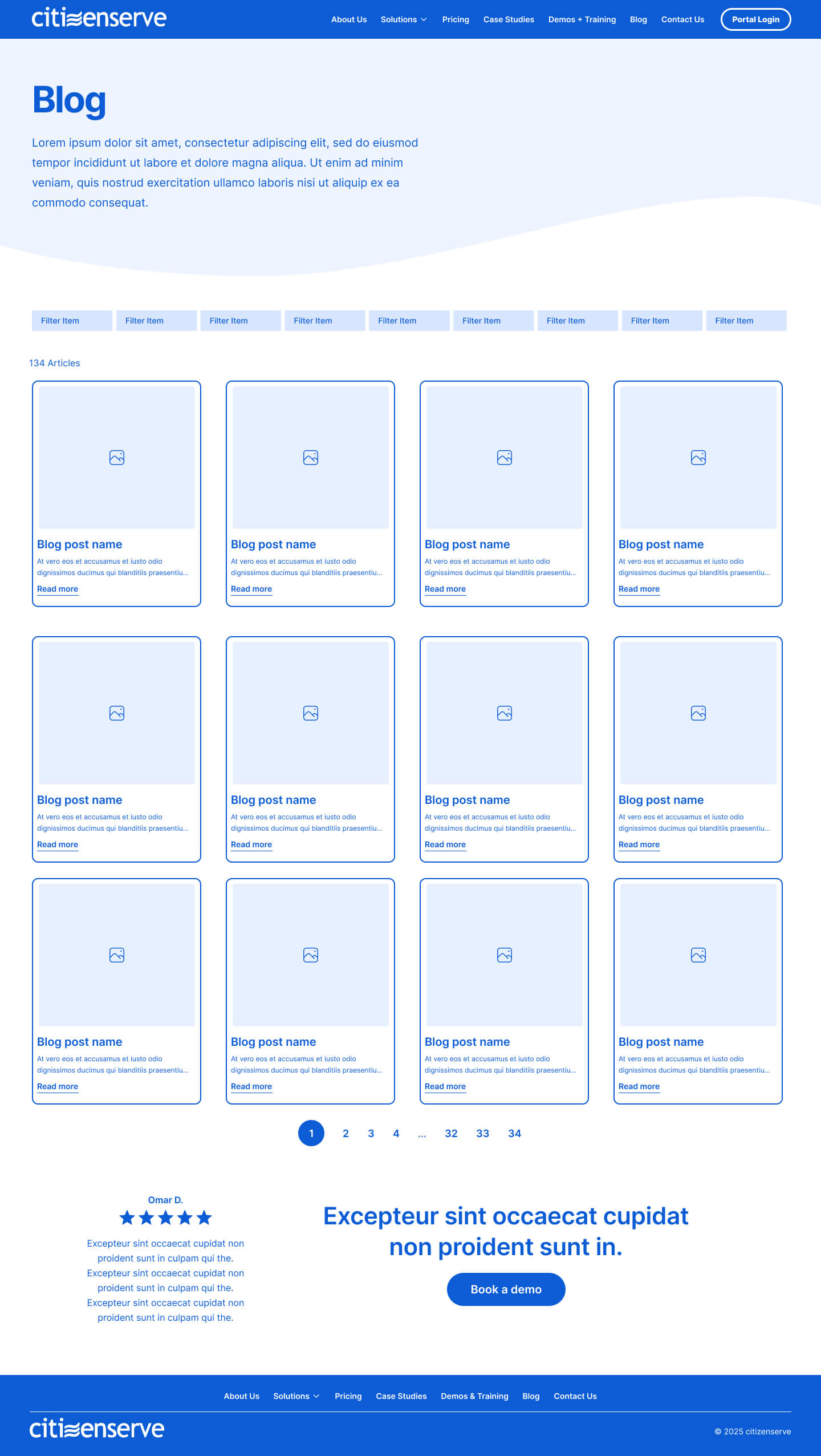
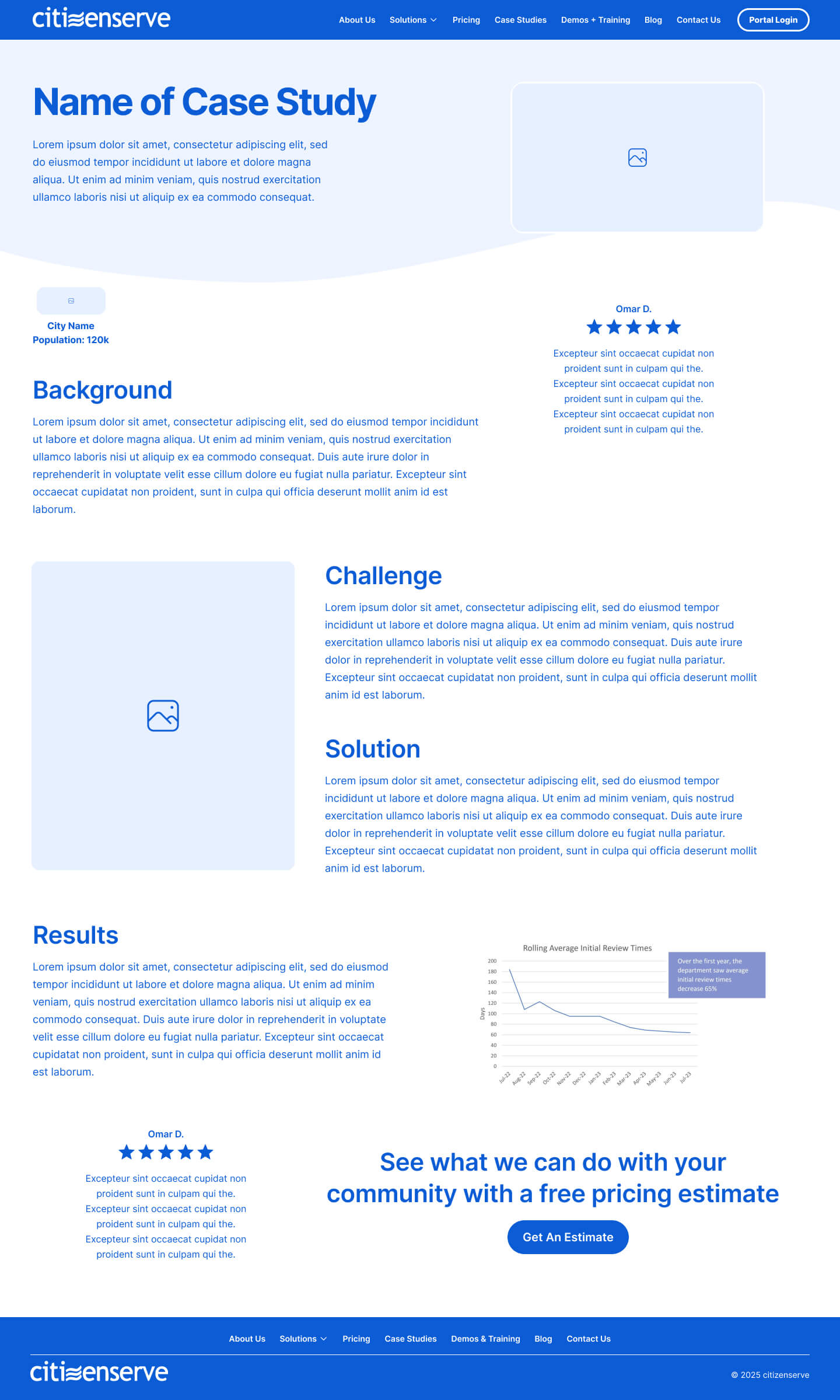
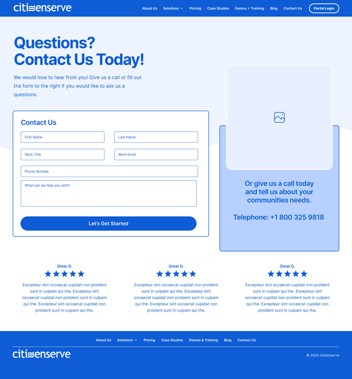
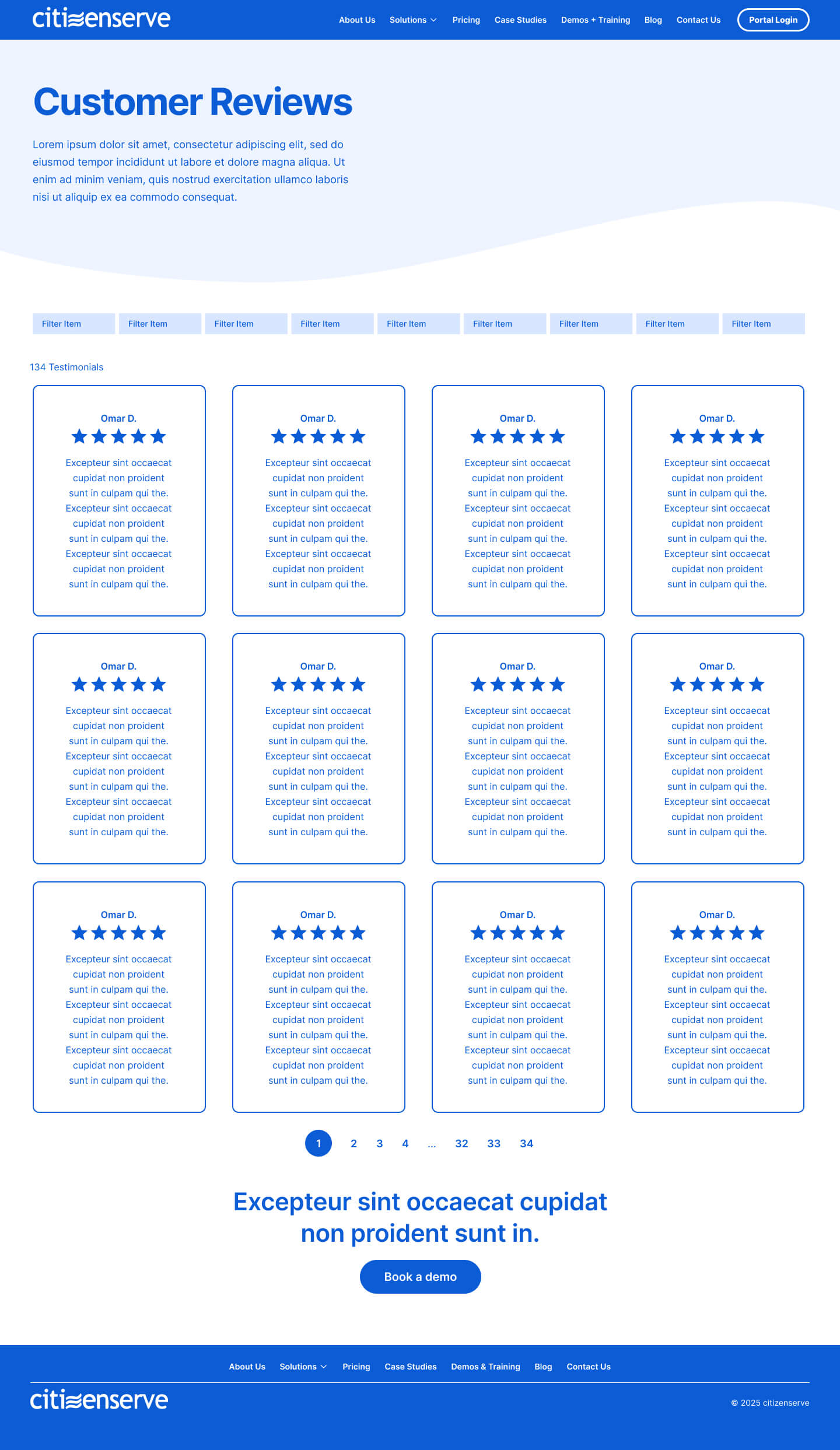
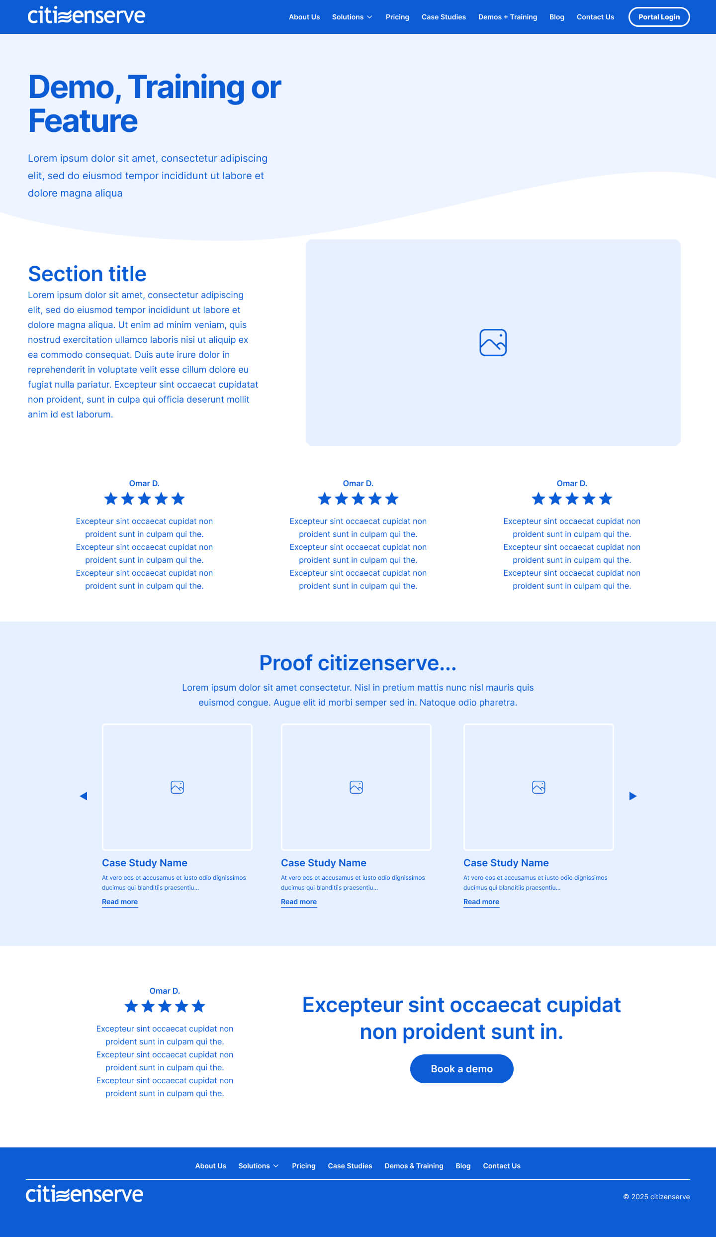
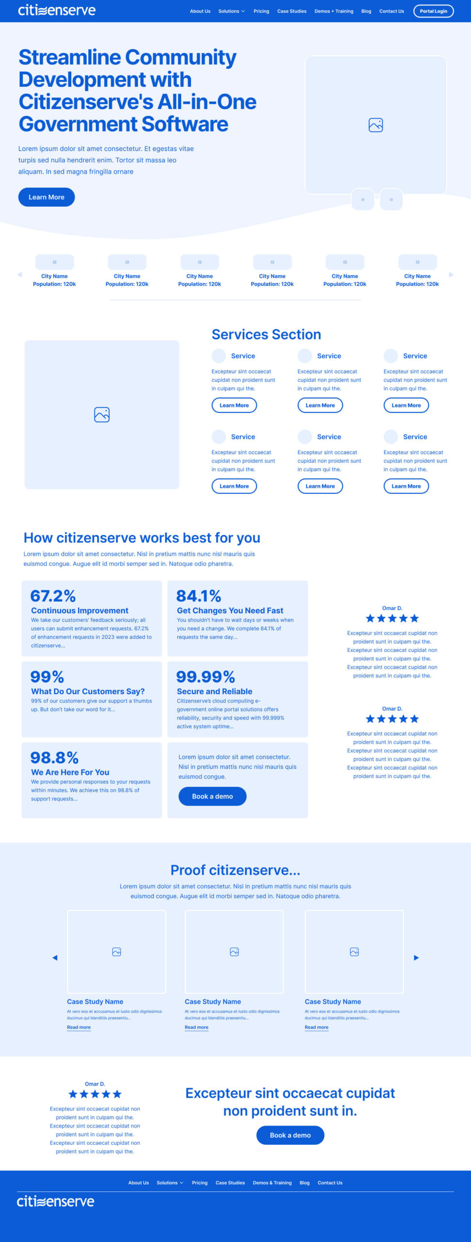
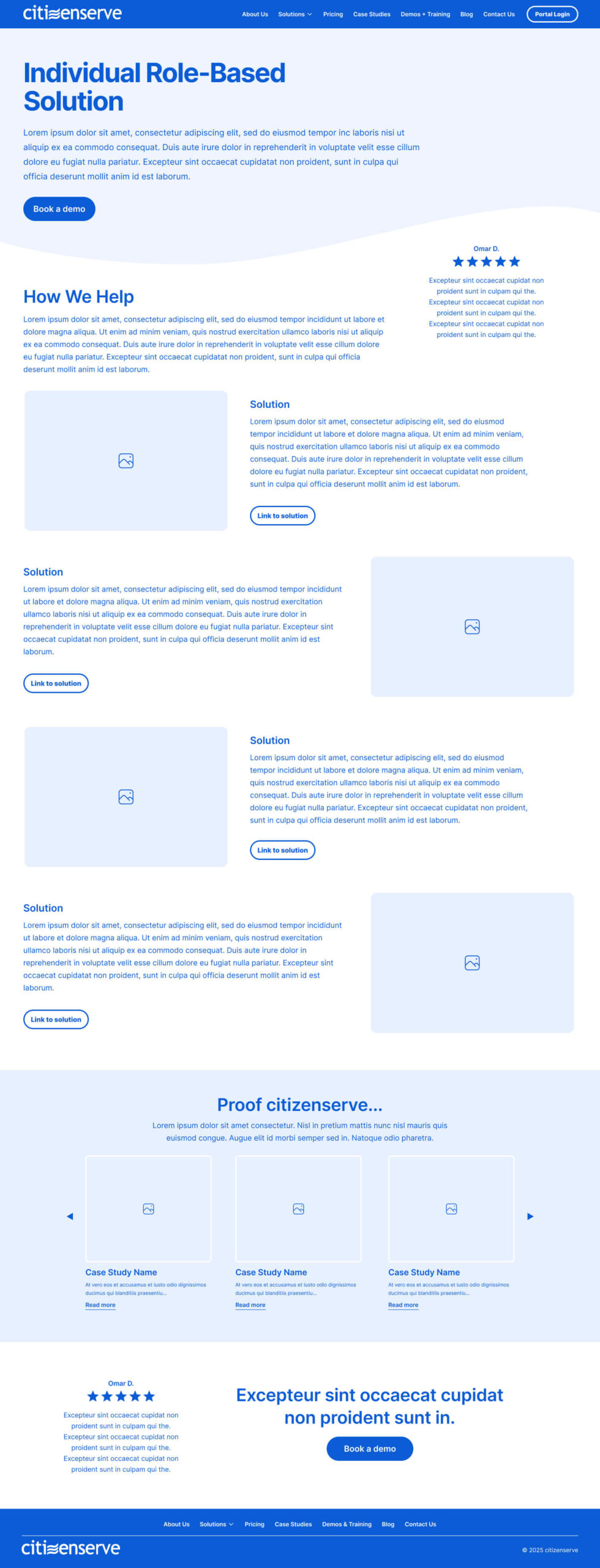
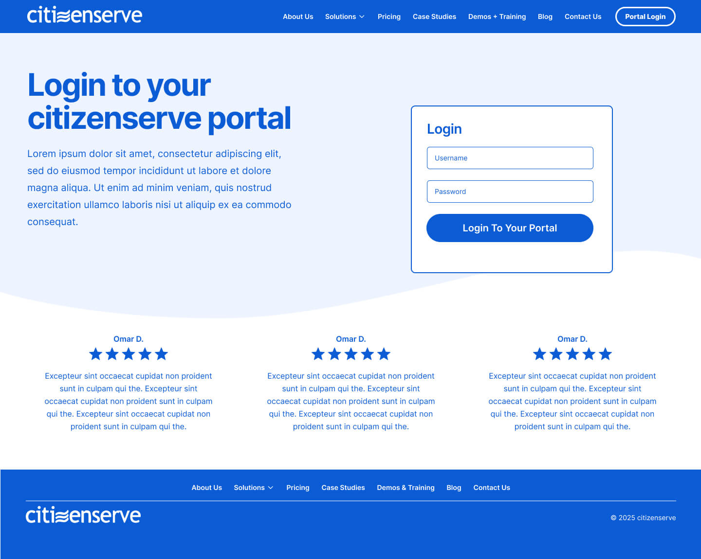
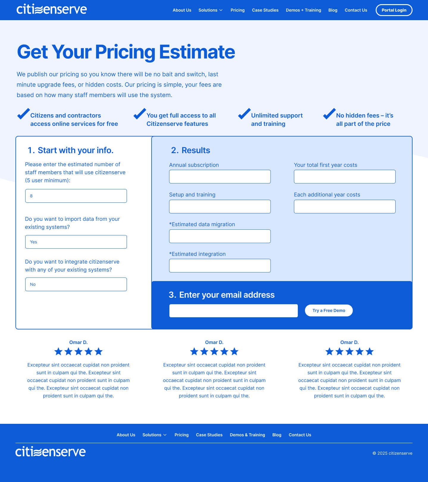
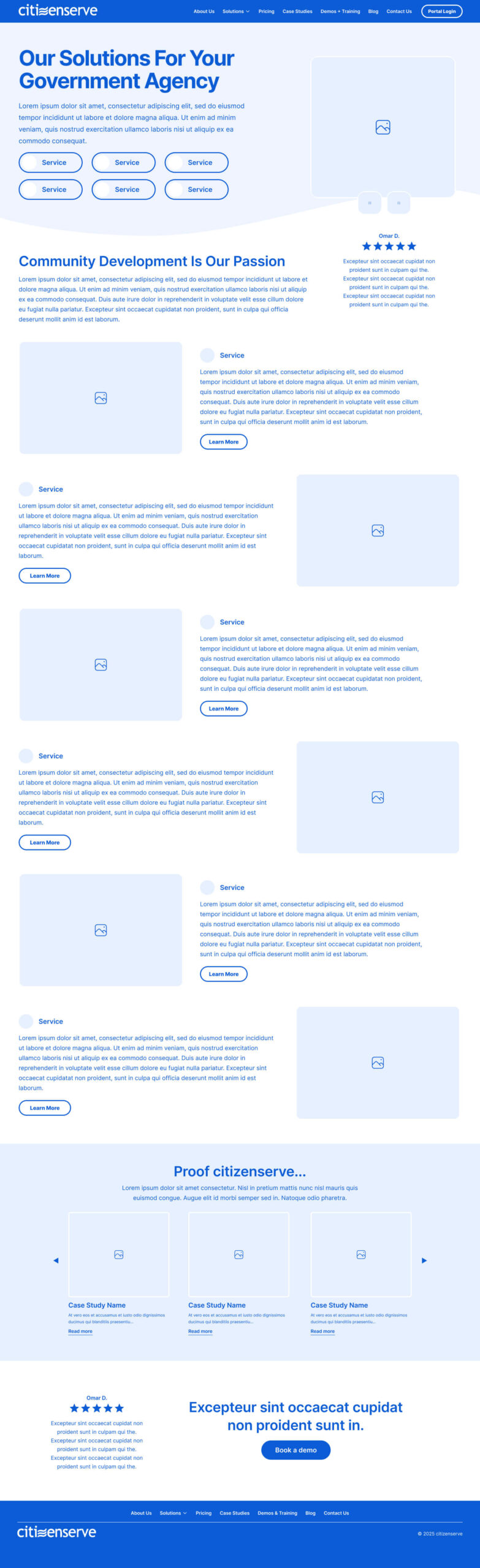
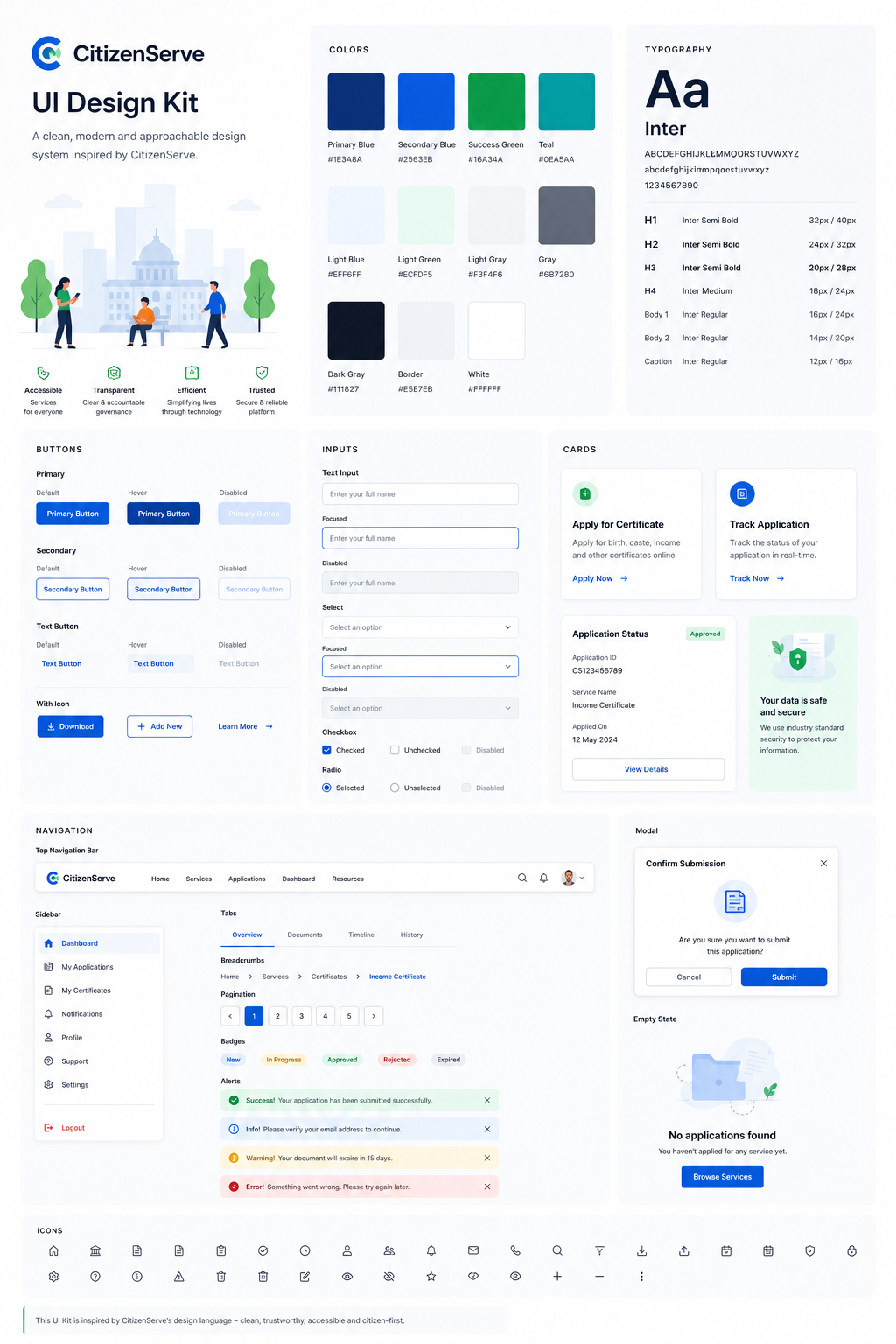
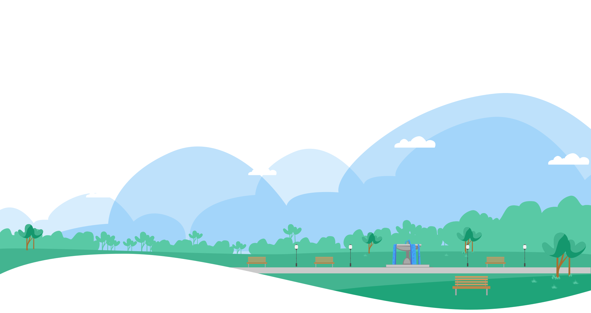
The redesign started with a compositional audit, identifying every page where layout structure was burying the key message or sending users toward a dead end. The design direction shifted toward open breathing layouts with a consistent typographic hierarchy, a clear scale relationship between display headlines, subheads, and body text, alongside custom illustration that gave the brand warmth and community character that screenshots never could.